

La Jacka Mobile
E2E Branding, Design and Development for Mexican Food Truck // July 2020 - Ongoing
The Team
Kiwi Design Studio - 4 Designers, all with different specializations
My Roles
User Research, Branding, Graphic Design, Photo Editing, UX Design, Copywriting
Tools
G-Suite, Procreate, Figma, Adobe CC (Illustrator, Photoshop, Lightroom), Webflow
The Challenge
Due to the 2020 lockdown, the La Jacka Mobile food truck had no efficient way of keep their customers updated about their business’ ever-changing circumstances, including truck location, hours, and availability. Rather than keeping information scattered across different platforms on the web, they needed a centralized location for all related information that would be easy to update.
The Design Process

Context
The Client
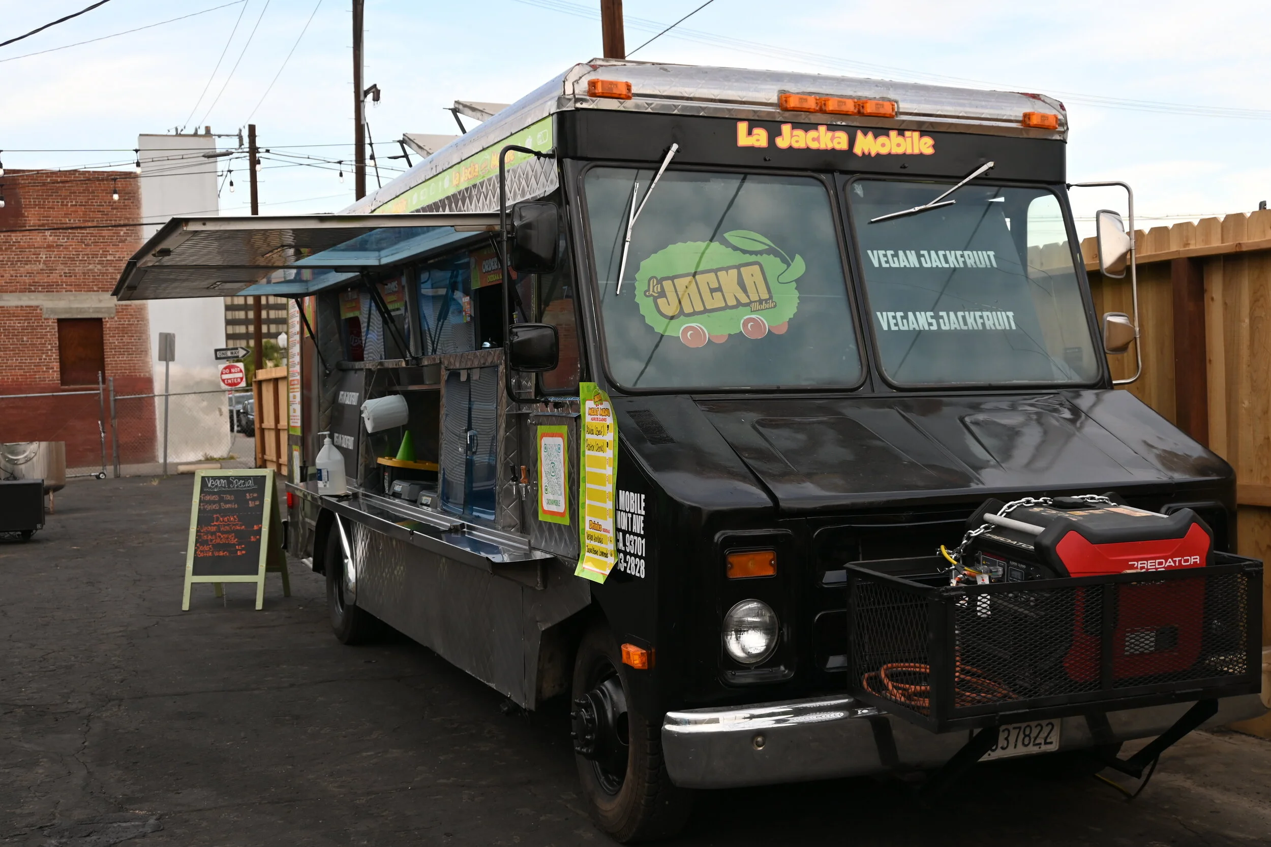
La Jacka is a family-owned food truck located in Fresno, CA that offers a variety of plant-based Mexican food made with organic, home-grown jackfruit. They believe that you don’t need to compromise rich and bold flavors to have healthy food options. With over one hundred creative recipes incorporating jackfruit, they’ve drawn a loyal customer base from all over central California. With their business continuing to grow, the owners are extremely busy and don’t have time to focus on things outside of running the truck.


Our Team
Our design studio is a team of four, all of us part of the same HCI program back at university. While we all share UX design as a skill, there is one person who is more strongly a developer, another who deals with content and clients, and a third who I often partner with in doing more visual design and creative work. Additionally, I run business operations for the studio.
Discovery
User Research
We began with competitive analysis to learn more about the industry and current scope of the market. We then followed with stakeholder and user interviews. From this gathered data, we crafted and studied user personas and storyboards to identify customers’ biggest pain points and needs, and then compiled our information into user journeys.
While I was not personally involved in the user interviews due to physical location, our teammates did a superb job in gathering the data to bring back so that we could all together work through how to organize it and dig for insights.
Persona Profiles

User Interview Data: Raw -> Grouped


User Journeys

Define
At this time, Instagram was the main channel of communication to their customers--and with no fixed schedule or location for their food truck, loyal customers were forced to go to far lengths to track down the truck such as creating dedicated snapchats and Instagram profiles and hashtags. In addition, the constantly changing menu meant that there was no single place to find what items were currently regular versus seasonal.
What we gathered from our research…
The unique situations of 2020’s lockdown caused a cascade of problems for all restaurants and small businesses, and La Jacka was no exception. Although they didn’t have an indoor space to transition out of, with outdoor events on hold, there was a shortage of opportunities for exposure. They needed a way to keep their business and their brand image alive despite the slow trickle of customers.
Crafting the Solutions
After reviewing the data we had, we realized our solution needed to encompass some very specific things:
Centralized location for all business information
Easy to update for busy business owners
Strong brand identity to use across platforms
Information migration and subsequent change management
Easy call-to-action for online ordering.
Tackling Two Deliverables
Based on our research and consulting with the client, it ultimately came down to two deliverables:
Branding, which included a full style guide, brand guidelines, some graphics and the application of branding to existing assets.
A website, updated with the new branding, that would provide all the information customers would need to find the truck, view the menu, order online, contact the business and learn about La Jacka.
Visual Design & Branding
The Original Branding
When it came to the branding, the client had already had a logo and a rough color palette to go off of. Unfortunately, without a style guide or brand guidelines, the brand assets such as menus, fliers, banners, and social media posts were inconsistent. While they stayed in the same color families, the shades they used were vastly different, and fonts were different across all assets.

Mood Boards to Style Guide
We began our design process by pulling together mood boards. Based on La Jacka’s existing branding, we pulled together a color palette that we then used to curate images of styles we could group together. We took two different paths for the mood boards; the first was Spanish Deco which had a more playful flair and earthy tones, and the second was Modern Minimalist with clean simplicity and bold contrast.
Mood Board 1: Spanish Deco

Mood Board 2: Modern Minimalist

We took a little mix of both boards and built our style guide as a hybrid of the two. The vibrant imagery of the Spanish Deco style informed our image choices (and our own photography), and we kept a more simple body font and clean lines in mind. All of the branding work was done in Figma.
Upon review with the clients, we were able to pivot based on their feedback. They loved the Spanish Deco style, with many aspects of it similar to the “ranchera” aesthetic that the owner was looking for. They wanted to emphasize farm-to-table and a connection with Mexican culture, while still feeling modern.
Simplified Style Guide

Exploring Style Tiles
We started putting together the style tiles to ultimately give the client an idea of how this branding would apply to the final website. With their approval, we would then follow the style guide and use these tiles as inspiration when it was time to do our high fidelity mockups


Design
Low-fi to High-fi Mockups
When it came time to design the website, the team hopped straight into Figma as we were working fully remote. Over live working sessions, we each built out low fidelity versions of the website, making sure to cover all the necessary components decided upon prior. This included:
Homepage
About page
Menu with images
Contact
Food truck schedule
Order online option
Mobile layouts

After working independently, we would regroup to review and walk through each person’s designs. From there we were able to agree on which features of each design would be logical to move forward with, and then after deciding on the final layout we moved into creating high-fidelity wireframes.
One of our major design decisions was changing the menu from a gallery of images to a line by line layout with a single image for each category of items. We found that a lot of the photos looked similar if not zoomed in, due to the same ingredients being used in most of the dishes. Having this zoomed in view allowed for more room to describe what was in each menu item with a larger, in-depth view.
Gallery Design

Line-by-Line Layout

Upon completion of our final wireframes, we reviewed with the owners at La Jacka to ensure that we covered all the bases. With their approval, we moved on to begin building out website and curation content for the website.
Develop
Website Development
We built the La Jacka website on Webflow to allow for more freedom and creativity. One of our team members did a majority of the layout development, and the rest of our team took care of filling in content and making smaller changes. Page by page, we took our wireframes from Figma and brought them to life, adding small animations and details for a more dynamic experience.

Content Curation & Photography
Content curation was unfortunately where we ran into the majority of our issues. Due to the busy nature of the business, the owners were unable to give us a lot of time to approve copywriting and other content. In the beginning of the project, they had given us some assets and materials to work off of; we used those to the best of our ability but were still lacking a good amount of content.
One example was photos. Unable to get updated photos to use from the owners, two of our team members journeyed back to Fresno in order to visit the truck in person. They were able to spend the day taking photos of all the dishes as well as the truck and staff, and upon their return the rest of the our team worked on photo editing.
Iteration & Final Thoughts
The project thus far…
Currently, we are in the “iteration” stage of this project. The website has been submitted to the clients, and we are awaiting any further changes that need to be made. Due to a lack of content, we are not currently able to publish some of the prepared pages, such as the “About Us” page which needs final approval by the owners to ensure the message being conveyed is accurate.
Our current contract with the client allows a period for necessary updates and changes. As fair as maintenance goes, we will be deciding on a format moving forward on how the client would like to deal with updating their truck schedule and menu changes, since they update on a semi-weekly basis.
Biggest challenges
Getting content from the owners
Sticking to a timeline—accountability
Takeaways & Lessons Learned
Set up expectations at the beginning of the project for both the client and ourselves can uphold. Because we were not able to establish from the beginning a solid timeline and expectations for what the client would need to provide, we constantly ran into the issue of waiting for content and approval.
Along with expectations, there needs to be set meet times for client review. There was no set cadence for meeting, and the project moved along much more slowly than it should have.